Weight Watchers
Brand Identity · Campaign
MFA Project
An identity exploration for Weight Watchers, focused on creating a more energetic and forward-looking visual language.
I developed a new logo, typography system, and campaign direction based on research into the brand and its audience.

Rough sketches for the new logo

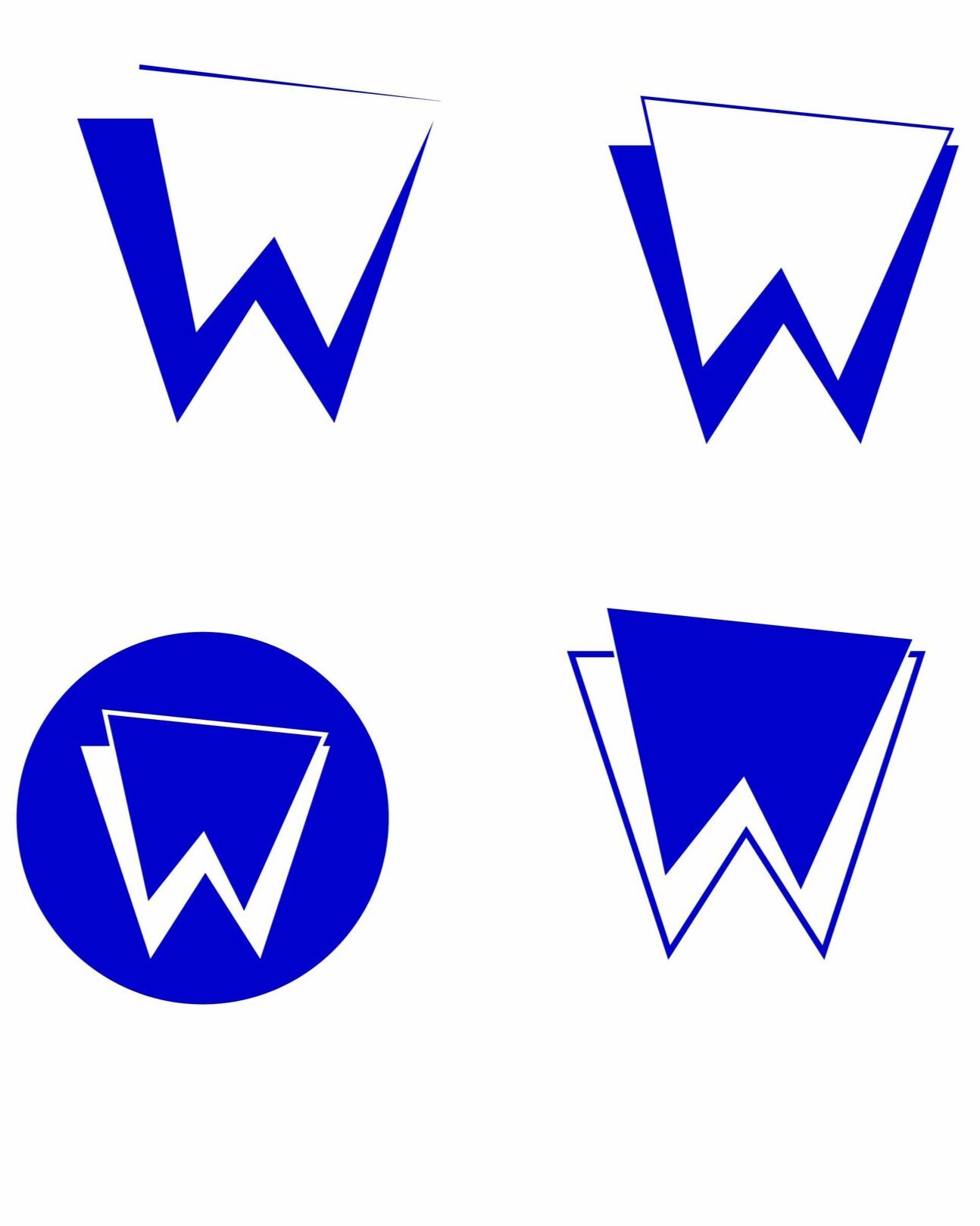
Redefined sketches

Final logo


Draft #1: These illustrations didn’t feel right for the Weight Watchers audience.

Draft #2: My second idea made use of stock images and a purple transparent layer to unite the imagery.

Draft #3

Draft #4: I tilted the blocks of text to match the asymmetrical logo. I also chose different images to create a better sense of cohesion.

Final Draft